
Project overview
Hearth & Oak is a fictional homeware brand used to explore a direct-to-customer store. The concept imagines a small maker moving beyond marketplace listings into a more distinctive shopping experience. I developed an editorial storefront direction, a simple visual identity and a mobile product-page concept around stoneware, oak boards and linen.
The challenge
Homeware is physical: weight, texture, finish and scale affect whether someone wants to buy it. A store needs to communicate that character through images while making practical product information easy to find. The design challenge was to create a calm visual experience without burying the product name, price, finish or purchase action.
Audience and assumptions
The assumed audience includes people buying considered pieces for their home and people shopping for gifts. Some may arrive from social content, while others want to browse a particular material or category. These are design hypotheses, not verified customer segments. The concept uses them to organise discovery and identify what a future prototype should test.
Design approach
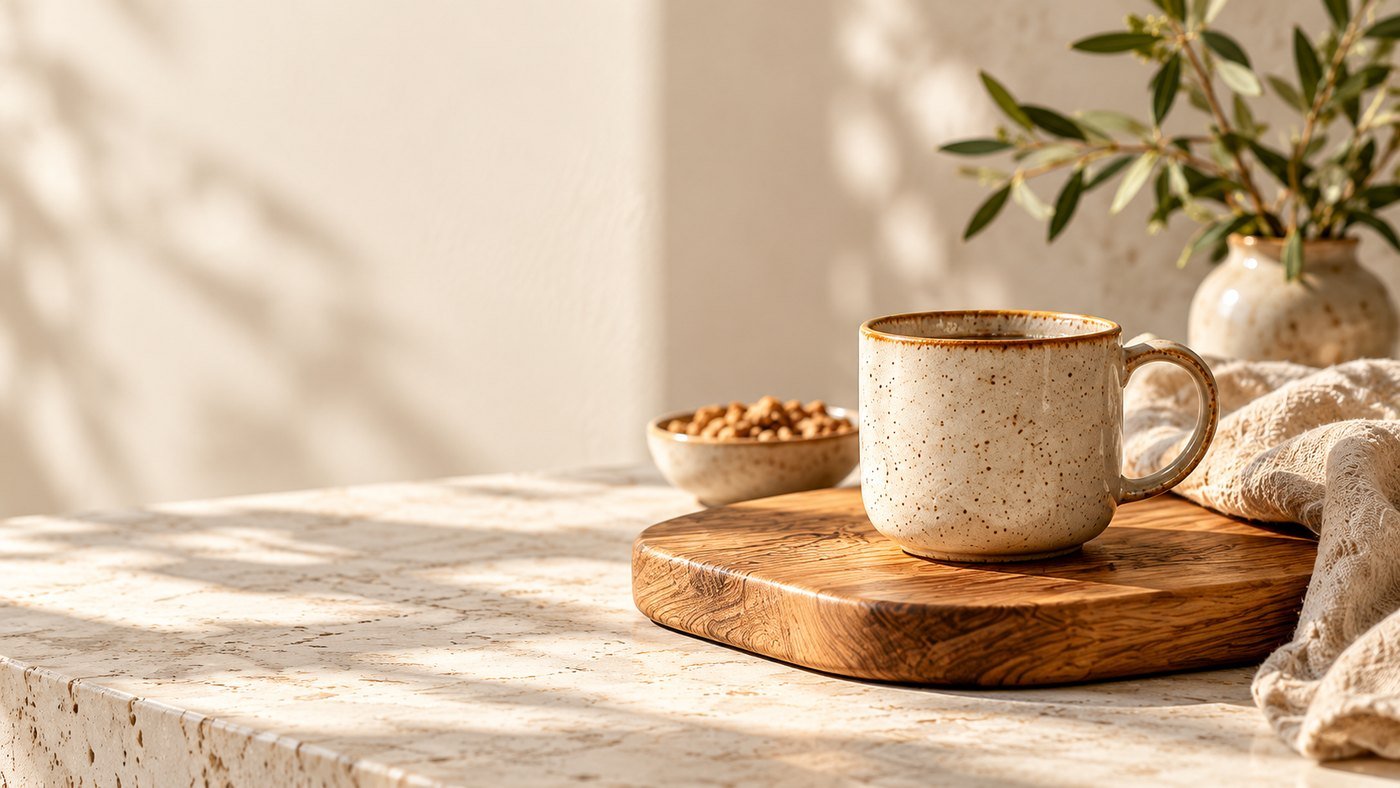
The homepage opens with a tactile still life and a short brand statement. Category images then give shoppers a practical route into stoneware, oak boards or linen. An Everyday favourites section brings named products and prices into view. The mobile concept places the product image, price, finish selection, quantity and Add to bag action in a familiar sequence.
Scope and responsibility
The work shown covers storefront art direction, identity exploration, interface copy and product-image direction. The desktop and mobile presentation and AI-generated still life are concept artifacts. A configured Shopify store, inventory, checkout, product specifications and customer research have not been completed as part of this work.
Visual direction
Imagery, colour and type
Typography: Cormorant Garamond for editorial headings and the wordmark, paired with Inter for navigation, prices and controls.
Design decisions
Key decisions
Make materials the visual anchor
Cream stoneware, visible oak grain and oatmeal linen establish the collection’s character. Warm neutrals keep attention on texture. The clean hero image leaves room for live text, while separate product images would provide the close-ups and scale references required for a real purchase decision.
Balance editorial type with practical controls
A warm serif gives headlines and the wordmark a quieter, crafted feel. A sans-serif supports navigation, prices and controls. This contrast lets the brand have a distinct voice while keeping the shopping interface direct and readable.
Offer a clear route from inspiration to product
The hero leads to the collection; the category row supports a more specific interest. Product cards show names and prices instead of relying on imagery alone. The example mobile page brings finish and quantity controls close to Add to bag.
Put purchase information where decisions happen
The proposed product template includes dimensions, materials, care, stock status and delivery and returns information. These details must come from verified product and store data. They would sit near the purchase decision or in clearly labelled disclosures, rather than being hidden in a distant FAQ.
Proposed journey
From first visit to next step
- 1Browse a category
- 2Open a product
- 3Inspect images and specifications
- 4Choose a finish and quantity
- 5Add to bag
- 6Review the cart
- 7Continue to Shopify checkout
Planned states include unavailable finishes, out-of-stock items, an empty cart and add-to-bag feedback. These screens are planned, not yet designed.
Concept outcome
The concept creates a consistent visual identity across desktop discovery and mobile product selection. It shows how an independent store could present a cohesive collection. It does not establish improvements in sales, conversion, average order value or repeat purchases. Those outcomes require a working store and measured customer behaviour.
Reflection
A strong product image earns attention, but practical information supports the purchase. The next iteration should bring the same care to dimensions, variant selection and delivery information as the concept gives to the homepage.
Your project next
Building an independent brand?
Share what you need. You'll get honest advice, a clear plan and a fixed quote.